
What is Artworks in pharma?
Artwork essentially encompasses for label design of pharmaceutical products. It is a crucial step in product development as beyond aesthetics, artwork plays a crucial role in conveying critical information and ensuring compliance. In this comprehensive guide, we delve into the nuances of Pharma Artwork and Labels, exploring their impact on the industry, compliance requirements, and strategies for optimization.
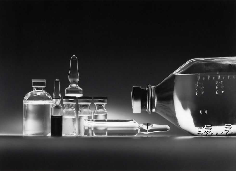
1. The Crucial Role of Pharma Artwork and Labels
Pharma Artwork and Labels serve as the face of a product, communicating essential information to both healthcare professionals and consumers. From dosage instructions to safety warnings, every detail matters. These elements contribute to brand identity, ensuring recognition and trust.
2. Compliance Matters: Navigating Regulatory Requirements
Pharma Artwork and Labels have to comply with stringent guidelines set by regulatory bodies. Failure to meet these standards can lead to costly delays and even product recalls. Hence it is important to have a clear understanding of regulations and implementing them to ensuring your artwork and labels are not just visually appealing but also legally sound.
3. Simple Artwork Optimization Strategies
a. Simplicity Sells: Keep designs clear and concise. A clutter-free layout improves readability and helps users quickly locate essential information.
b. Color Psychology: Leverage the psychology of colors to convey a sense of trust, reliability, and efficacy. Understand cultural nuances when designing for a global audience.
c. Font Legibility: Opt for easily readable fonts. Small text and elaborate styles may compromise clarity, leading to misunderstandings.
4. Labels:
Labels are not just stickers; they are information hubs. Incorporate the following strategies to enhance label effectiveness:
a. Hierarchical Information: Organize information hierarchically, emphasizing critical details. This ensures users can prioritize information based on their needs.
b. QR Codes for Digital Engagement: Embrace technology by integrating QR codes that link to additional resources or product information. This enhances user engagement and provides a modern touch to traditional labels.
Frequently Asked Questions about Pharma Artwork and Labels
Q1: How often should Pharma Artwork be updated?
A: Regular updates are necessary, especially with changing regulations or product modifications. Aim for an annual review, but be prepared to adapt as needed.
Q2: What information is mandatory on a pharmaceutical label?
A: Key information includes dosage instructions, active ingredients, warnings, and contact details. Always adhere to regional regulatory requirements.
Q3: Can creative designs compromise compliance?
A: While creativity is encouraged, it should not compromise clarity or compliance. Striking a balance is essential to ensure both aesthetics and adherence to regulations.
If you are looking for a pharmaceutical manufacturer, consider speaking with us, we have over 30 years of experience, and our product range expands into 60 therapies and over 400 formulations in various forms- tablets, liquids, capsules, externals etc.


https://xosoplus.mobi/ mình ghé thử cho biết vì thấy mọi người nhắc hoài, kiểu vào xem giao diện họ làm ra sao thôi. Vừa vào là thấy họ chia mục theo ngày khá dễ hiểu, có phần XSMB theo ngày nhìn cái là định vị được ngay, không phải mò lâu. Mình lướt xuống thì ấn tượng nhất là bảng “Đầu Lô tô / Đuôi Lô tô” trình bày gọn gàng theo cột, nhìn phát hiểu liền chứ không bị chữ số dồn đống. Cuộn trang cũng ổn vì các tiêu đề tách khối rõ, nên mắt không bị loạn khi xem số liệu. Nói chung cảm giác như họ ưu tiên cho người xem lướt nhanh, đặc biệt là khu…
https://gg88.llc/ hôm bữa mình thấy ai đó nhắc nên vào thử cho biết. Vừa mở lên là thấy kiểu thiết kế gọn gàng, nhìn hiện đại mà không bị rối mắt, màu mè vừa phải nên lướt khá dễ chịu. Mình không đọc kỹ nội dung đâu, chủ yếu xem cách họ trình bày cho người mới có bị “ngợp” không, thì thấy ổn. Các phần thông tin chung với phần trải nghiệm được tách ra khá rõ, kéo xuống cũng mượt, không bị giật hay load lâu. Cái mình thích là bố cục tối giản nên tìm thứ mình cần nhanh hơn, khỏi phải đảo mắt nhiều. Nhìn chung trang này làm theo kiểu chia danh mục khoa học…
sun win dạo này thấy bạn bè nhắc hoài nên mình cũng ghé thử cho biết. Mình chỉ vào lướt nhanh chứ không ngồi mò kỹ, chủ yếu xem giao diện có dễ nhìn không thôi. Vừa mở lên là thấy trang khá sáng sủa, bố cục thoáng nên mắt đỡ bị “ngợp”. Mình thích nhất là cách họ chia nội dung thành từng khối rõ ràng, nhìn qua là biết phần nào ra phần đó, không phải kéo lên kéo xuống nhiều để tìm. Thanh menu cũng để ngay chỗ dễ thấy nên chuyển qua lại mấy mục khá tiện, bấm vài lần là quen. Nói chung cảm giác dùng ổn, nhất là mấy khung thông tin trình bày…
This was a nice read because it stayed simple and didn’t make me feel like I had to decode anything. I liked how it sprinkled in quick everyday examples so the tips actually stuck, and the explanations felt practical instead of just “do this, do that.” Halfway through I ended up clicking around newimage.io since it gives off a similar helpful vibe when you want to go a bit deeper without getting overwhelmed. The writing also felt like it came from someone who’s tried this stuff for real, not just recycling the same generic points. And honestly, the page was easy on the eyes—short chunks, clear headings, and it was super skimmable thanks to the clean layout with those tidy…